Self-Care Companion: amelio App Case Study
UX Research
UX Design
Branding
Prototyping
About This Project
Services
Tools
Adobe Illustrator
Figma
Google Forms
Google Sheets
Mural.co
Framer.com
Methods
Big Ideas Vignettes
Design Thinking
Ethnographic Interviews
Heuristic Evaluation
Lean Product Canvas
Prioritization Matrix
VIMM Load Analysis
In Short…
In a world filled with endless to-do's, constant notifications, and overwhelming pressures from work and life, how can we help young people find the resources and help needed to take care of their mental wellness?
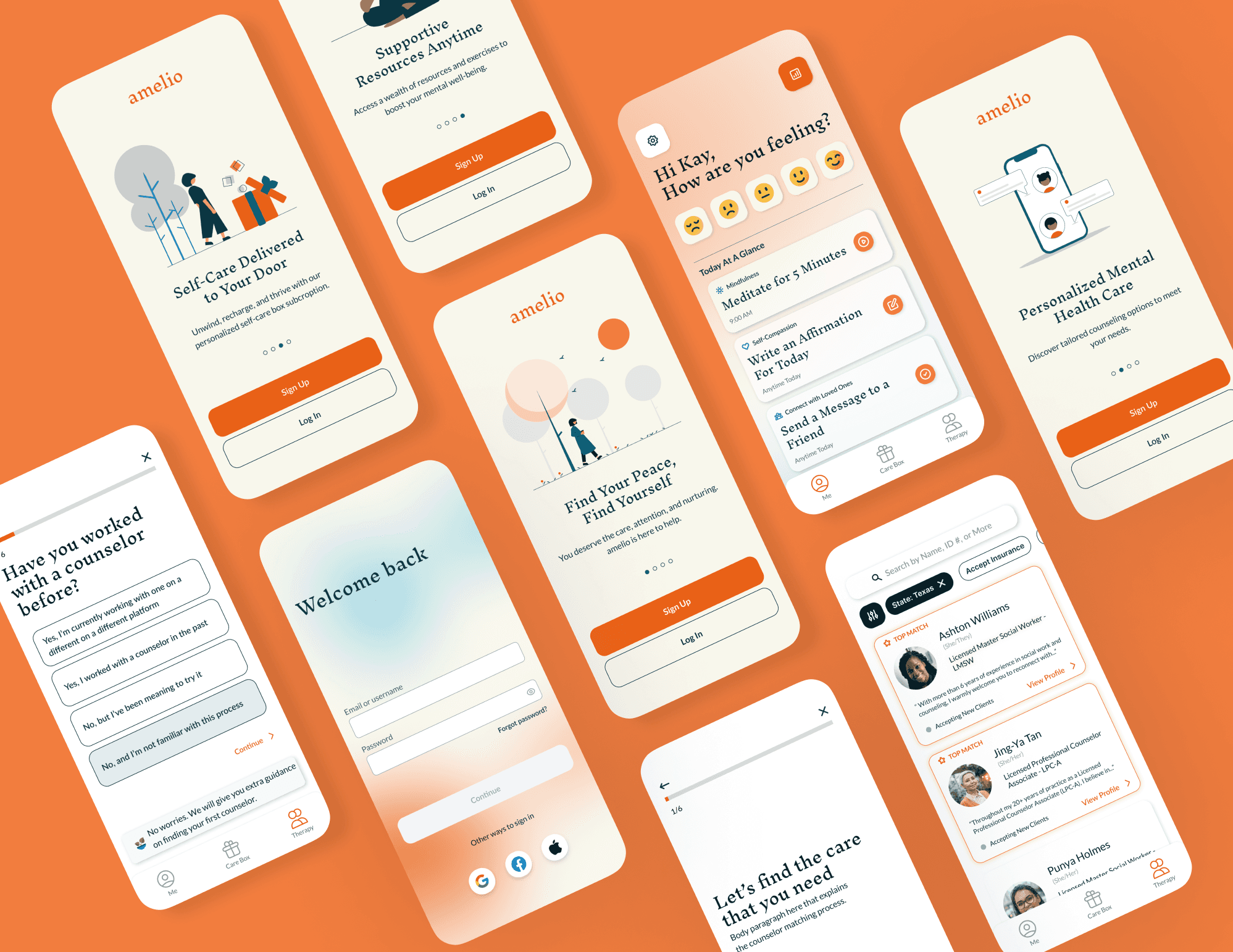
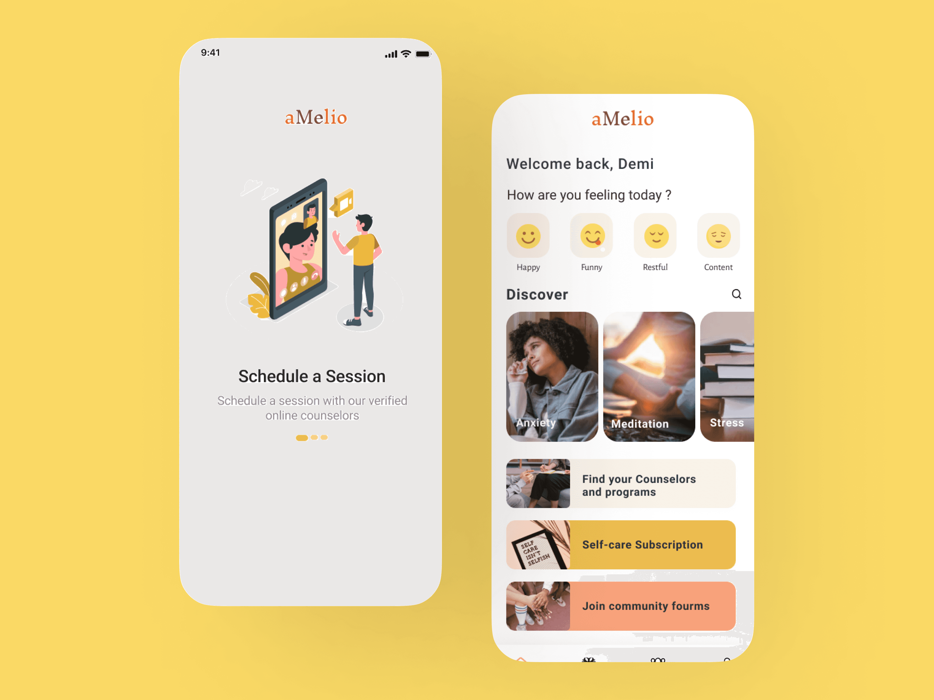
Amelio is a mental health and wellness app concept that aims to provide self-care resources to young adults and young professionals. The name “amelio” was inspired by the word “ameliorate,” since the path to mental wellness is the path to ameliorate—to repair and heal.
Process Overview
Primary Research
User interviews, stakeholder interviews and surveys.
Secondary Research
Maekect Research
UX Design Artifacts (And Their Limits)
User Epics/Hills and User Stories
Big Idea Vignettes
Design System
Rapid Prototyping
Usability Testing
Iterate and Redesign
What I Learned
Not All Projects Have "Next Steps"
Ever since my team and I presented the first iteration of amelio, I knew that I wanted to revisit amelio one day. Two years later I sat down and drafted out my plan for redesigning amelio.
In 4 months, I made the following changes based on a general visual and usability audit, usability test insights, and audience feedback from our final presentation
A robust design system creates a seamless experience across platforms and devices.
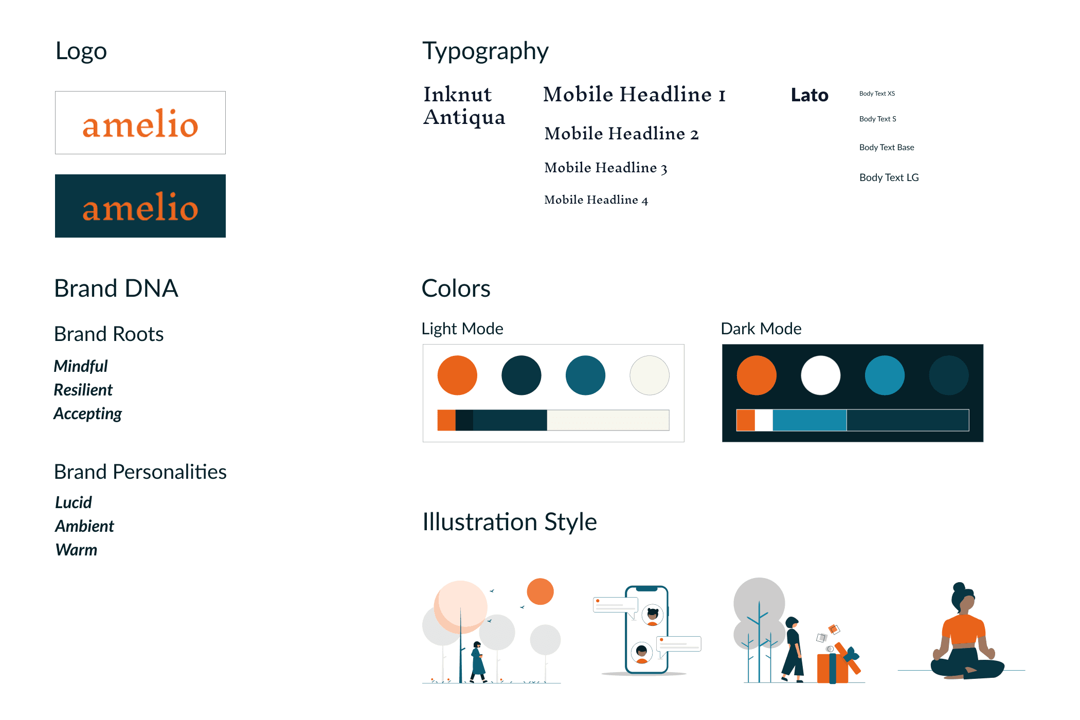
An updated branding that resonates with both existing and new users.
A mockup of amelio in dark mode so users can reduce eye strain with this meticulously crafted option.
Research & Discovery
We studied mental health trends and surveyed the competitive landscape. We also gained insights through listening intently to users, uncovering their needs through interviews, and mapping their journeys. This potent mix of trend exploration, competitive analysis, and user-centric research steers our design decisions, ensuring the product is heading in the right direction.
Current Studies & Trend Review
A review of some recent mental health research and trends revealed insights to help us further understand how to shape our design opportunities.
Market Research
After reviewing mental health trends, we analyzed popular mental health apps to determine issues, gaps, and problems with other marketplace solutions.
Interviews & Surveys
After reviewing the competitive apps, we gained insights and inspiration by surveying and interviewing users. This user research helped us to gain a deep empathy for our customers and understand their wants and needs.
UX Research Artifacts
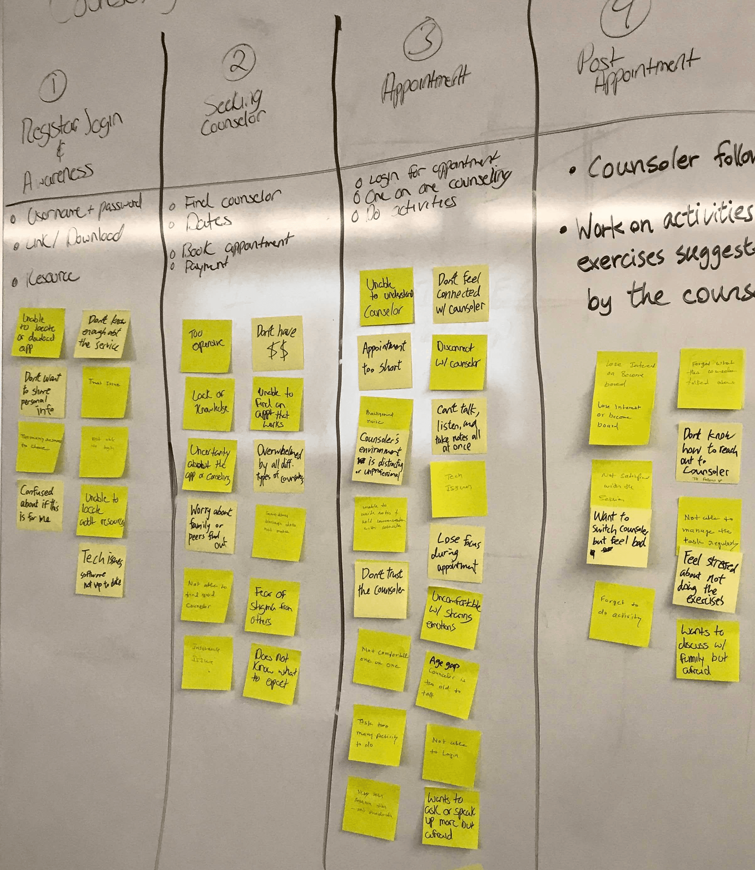
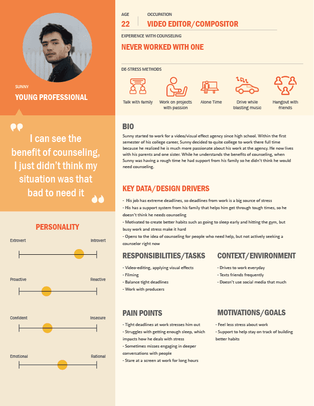
After performing our surveys & interviews, we built user personas and validated them with our customers. Next, we wanted to gain context by building a user journey map to determine pain points within the current experience.
Survey Results Highlights
We surveyed a targeted group of adults between the ages of 13 and 35 to understand how they are addressing mental health issues, as well as their outlook on counseling.
of participants deal with mental health issues
of participants could not recall a moment when someone really understood them
of participants went to counseling at least once
person had been to counseling for longer than a year. Yet, 80% had been to counseling one time, which is a high abandonment rate.
User Interviews
We interviewed 4 patients to gain key insights on how they deal with mental health issues. Plus, we wanted to identify what people say, think, feel, and do under stress. We also interviewed 2 counselors to find these directional insights. Our counselors are seeing their patients deal with specific problems and use different coping strategies.
Interview Quotes
Change of Direction Driven By Research Insights
We began with a vision and a roadmap. However, our user research revealed unexpected insights that challenged our initial ideas, leading us to reshape amelio. Here're 2 surprising research insights that led us to pivot from our initial product concept.
Audience Shift and Legal Considerations
Teenagers presented legal hurdles and privacy concerns, leading us to pivot to young adults in college or young professionals. This shift opened a viable, compliant path to reach a demographic ready to navigate mental health resources independently.
Market Landscape and Product Positioning
User research exposed limitations in existing platforms like BetterHelp (low counselor pay) and Teledoc (insurance complexity). This prompted us to rethink our product positioning and focus on a unique niche that shifts away from the aforementioned two platforms.
A Shift Towards Co-Design
Rethinking Common UX Design Artifacts
We started this project using familiar UX research artifacts like personas and user journey maps. That's what we are taught in our curriculum, and they seem to be industry standards, so why should we think or do differently if this is what schools and workplaces expect of us?
However, with time and learning, I've come to recognize their limitations. As critique around the oversimplification of human experiences within these tools grows, I see how empathy in research can become a checkmark in a box, hiding the need for ongoing engagement. Here are some examples of discourses that challenge the misuse of empathy and common UX artifacts in research.
Literature on the Limits of Common UX Artifacts
Today, if given the chance to revisit this project with a team, I would choose a different approach. Collaboration and co-design would be at the heart of the research process, fostering genuine participation from the intended users. This shift aligns with a trauma-informed lens, not just in research but throughout the entire service design journey. It's time to move beyond empathy as a tool and embrace it as a continuous practice, one that prioritizes genuine connection and iterative learning over extractive operations.
THE PONDER POND
What Do You Think?
NOTE: Your answers will be visible to anyone who also filled out this form. Please don't share sensitive or personal information in this form.
Define & Ideate
Picture this: a stressed student finally breathing easier, a parent finding the support they craved, a professional feeling hopeful again. That's what we wanted to create, and the design phase was our playground. We whipped out our sketchbooks, built prototypes like Legos, and played with layouts until things clicked. It wasn't just about features or fancy graphics, it was about making something that felt real, helpful, and maybe even a little magical.
Product Positioning
Using the Lean Product Canvas, we are able to focus on defining the big ideas of our product, what makes it unique, and how it will generate profit. It provides a holistic view for us to consider new ideas from a user centered focus.
User Epics and Stories
Building a product that truly works for its users requires deep listening and thoughtful action. That's why, after delving into research and insights, we knew crafting a personalized user experience was key. We wanted to empower individuals to alleviate stress and access the care they deserve, on their own terms.
But how do you translate user epics into tangible user flows? Here's how:
Mapping the Landscape: We started by creating user personas, detailed portraits of individuals representing our target audience. Their hopes, needs, and challenges became our guideposts.
Zooming in with User Stories: Each persona's journey was then broken down into bite-sized user stories, detailing specific goals and interactions with amelio. These stories, filled with empathy and understanding, kept our development laser-focused on user needs.
Building with Intention: Armed with these insights, we designed intuitive features and interfaces tailored to address individual needs. From personalized self-care plans to therapist recommendations based on unique preferences, every step was crafted to guide users towards their well-being goals.
From Pain Points to Opportunities
The result? An amelio experience that feels less like a one-size-fits-all app and more like a trusted companion, evolving alongside individual needs and aspirations. It's a testament to the power of listening, and a promise to keep building a space where well-being truly flourishes.
Updated and Refreshed Branding
Amelio's brand takes its cue not from sleek perfection, but from the gentle act of amelioration. Just like its name, we envision amelio as a safe haven, a space to nurture your well-being and embrace quiet moments of self-care. From the soft color palette to the friendly illustrations, every element whispers a warm "It's okay to be you", inviting you to embark on your personal journey of mental wellness with kindness and compassion.
Visions in Action: Bringing the amelio User Experience to Life
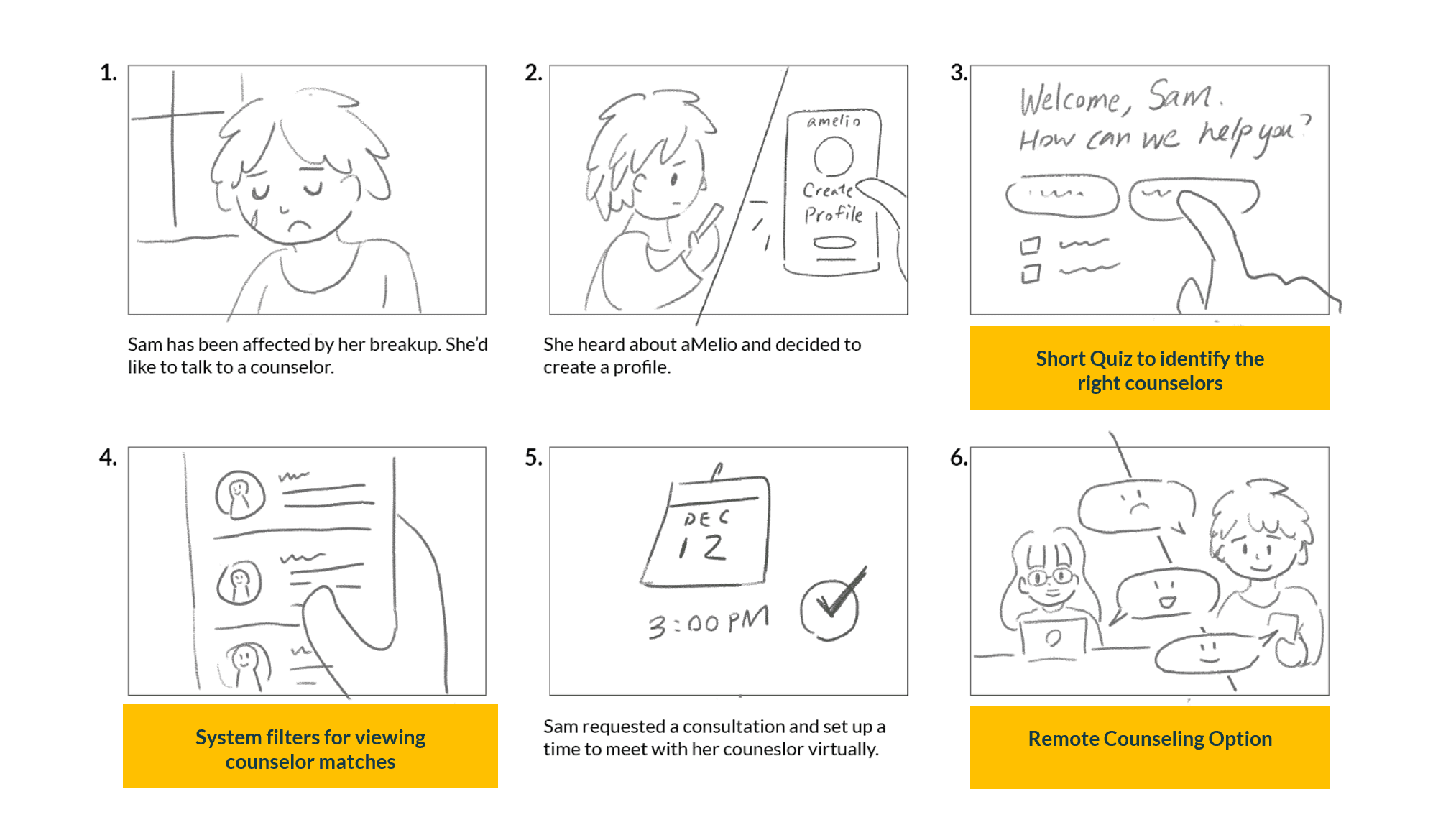
Bringing amelio's promise to life, our storyboard paints a vibrant picture of key user experiences. It's a visual companion to our user epics and stories, showcasing how young adults seamlessly navigate booking a counseling appointment. From browsing therapist profiles to scheduling a session that fits their needs, each step unfolds with intuitive ease and a touch of warmth, reflecting amelio's dedication to user-centered care.
Experience Design Activities Highlights
Here are our design activities at a glance.
key features illustrated by 2 handcrafted storyboards
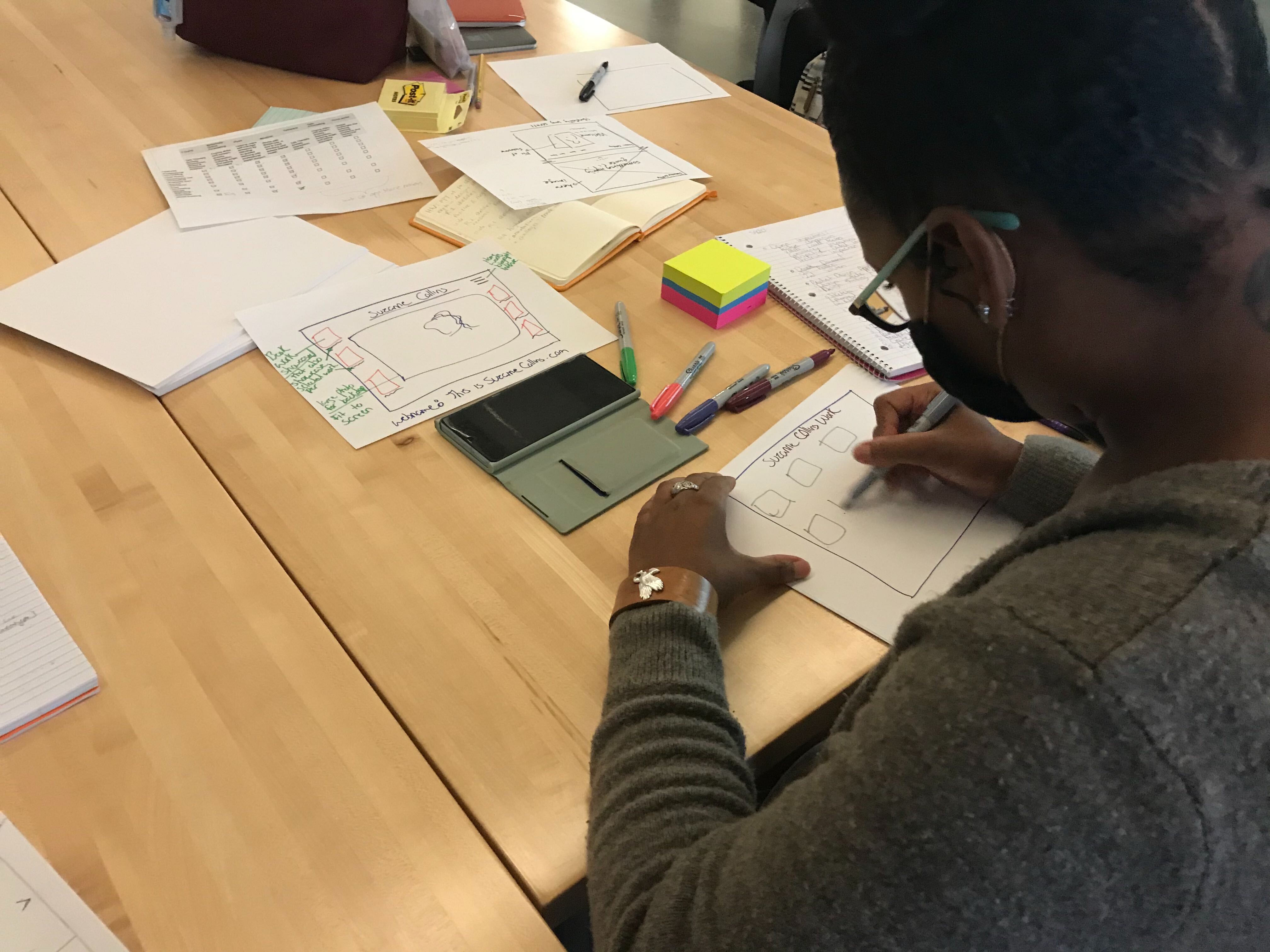
UI sketches and brainstorming ideas
new!
pages with updated component library and branding
new!
scalable interactions in prototype
Design & Test
From sketches to screens, amelio eventually took shape in Figma. After brainstorming diverse branding and UI options, we crafted a high-fidelity prototype for internal review and user testing. The valuable feedback from our testing fueled further refinement, ensuring our app not only looked great, but felt effortless to navigate on the path to well-being.
First Sprint
Guided by research, user stories, and flows, we iterated from low-fidelity sketches and wireframes to polished Figma screens. During our first sprint, we designed 20 different screens, 89 unique interactions, and 3 workflows.
The first iteration of amelio
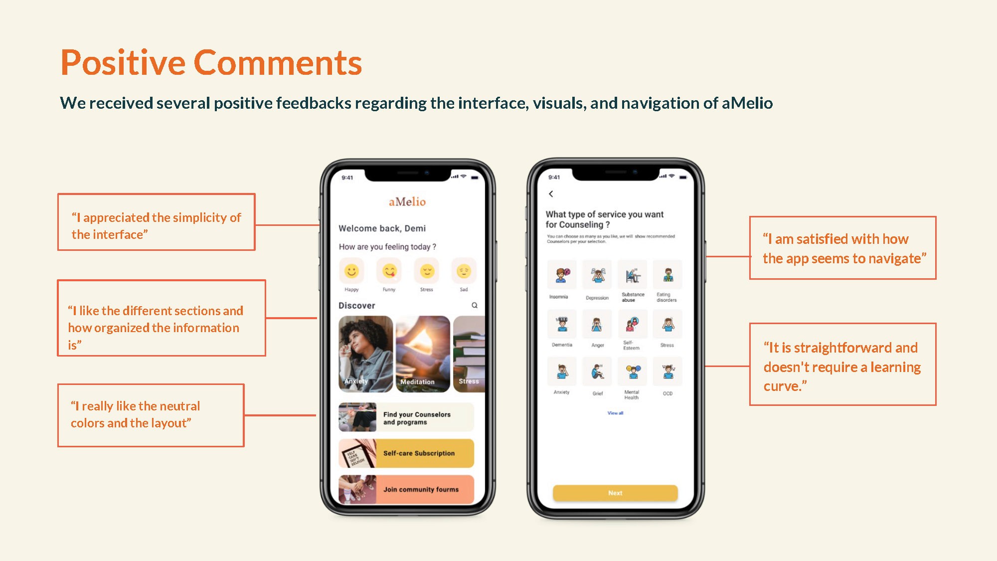
Usability Testing + Comments
We conducted usability tests with 8 prospective users to put our original design to test. We collected valuable feedback and insights from the tests and earned a System Usability Scale score of 65 out of 100. We made several improvements before the final presentation at the end of the semester.
Second Sprint
It is crucial that my priorities and focus for this second round of iteration is crystal clear so I can use my time and energy effectively while addressing the most important challenges that amelio face.
I first gathered feedback from usability testing and our audience during the final presentation, as well as areas of opportunity I identified from a general visual and usability evaluation of the original design. I framed them into Roses, Thorns, and Implications.
Roses refer to the positives and strengths of the current product, Thorns refer to areas of improvements or challenges, and Implications translate to action items that maximize the positives and address the negatives.
Additionally, I use the Ladder of Abstraction to identify my super objective for this project and envision the final product.
With all the action items derived from the previous two steps, I plotted them into a prioritization matrix that identifies high-impact and high-feasibility items. I made sure to define what constitutes "high impact" and "high feasibility" and their opposites before I started plotting my graph.
Knowing my overly ambitious tendency to try to tackle more tasks than what's realistic to accomplish within a timeframe, I performed a 20/80 analysis on all of the action items and honed in on high-impact problems.
Showcase & Takeaways
From research sketches to a live prototype, amelio evolved through constant iteration. Pivots steered our course, while user testing honed the UX design. Now, amelio boasts intuitive interaction and a cohesive visual identity, ready to guide users on their wellness journey.
What I Learned
Here are some of the lessons I learned from this project.
Connecting Branding with Design System
My design career started in branding and visual communication, so creating a visually appealing brand guideline for amelio was not a problem. But I wanted to learn more than just colors and fonts. I wanted to make amelio user-friendly and efficient for both users and developers. So, I studied design systems, learning from leading examples like IBM Carbon and Google Material. This helped me create a comprehensive design system that goes beyond visuals, making amelio easy to use and maintain for both users and developers.
Create Or Edit—Never Both At Once
The pressure to deliver flawless designs right off the bat can be paralyzing, making it hard to even begin. I've learned to separate creation from critique: when I'm brainstorming and exploring ideas, I silence the inner critic and focus on freely generating possibilities. The editing stage is where I refine and polish, allowing for judgment and revision.
What's Next?
Cultivate a Trauma-Informed Research Team
Investigating mental wellness issues is a delicate subject that might provoke uneasy circumstances, or even unintentionally activate somebody's traumatic reaction. To advance amelio's growth in a responsible and ethical manner, a trauma-aware research team is crucial.
Shift From Extractive Research to Collaboration
Inspired by sahibzada mayed, a fellow presenter at the 2023 Advancing Research Conference, I have been contemplating the extractive practices prevalent in UX research. It is important to distinguish between researching on communities versus researching with them. To further the development of amelio, a well-considered plan of harm reduction and participatory research that centers around relation-building and care is necessary.
Team
Meah Lin—Team Lead, UX & Graphic Design
Special Thanks
Professor Brian Sullivan
Professor David Wolske
Samuel Baker
Kay Seedig
