
Hi There! I'm Meah,
An Impact-Oriented Designer of Digital Systems.
I favor an insightful question over a convenient answer. With curiosity and resilience, I enjoy collaborating with small teams to create holistic designs that incite change, whether through intuitive UI's or carefully crafted visuals.
Select Works
UX Design
Brand Design

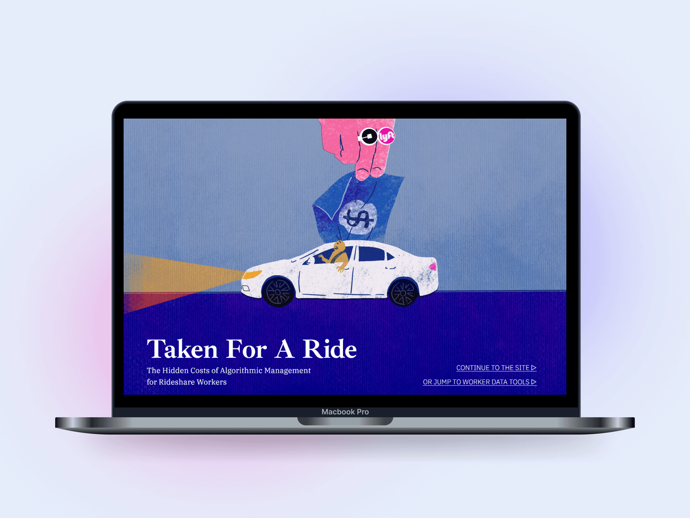
Uncovering the Hidden Costs of Ride-Share Gig Work
Scope of Work
Design System // Responsive Website Design // Illustration // Higher Education // Worker Rights
Tools & Methods
Figma // Procreate // Design Thinking
🔗 Link to External Page
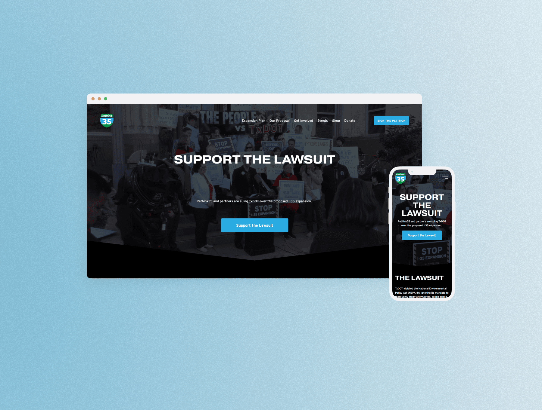
Fundraising Against Structural Inequity in Austin, TX
Scope of Work
Responsive Website Design // User Flow Map // Non-Profit
Tools & Methods
Figma // SquareSpace

Scope of Work
Service Design // User Research // Service Design Blueprint // Accessible Design // Stakeholder Presentation
Tools & Methods
Figma // Keynote // Co-Design Workshops

🔒 Invitation Only
AI-Driven Innovation at a Fortune500 Automaker Company
Scope of Work
UI Design // Usability Testing // Rapid Prototyping // Gamification // B2B Consulting
Tools & Methods
Figma // Mural.co // OpenAI


Coming Soon
Exploring the Boundaries of AI in Social and Medical Case Work
Scope of Work
Co-Design Workshops // Qualitative Data Coding // LLM // Social Works
Tools & Methods
Miro // Figma // Notion // Atlas.ti // Co-Design
Select Works
UX Design
Brand Design
Uncovering the Hidden Costs of Ride-Share Gig Work
Scope of Work
Design System // Responsive Website Design // Illustration // Higher Education // Worker Rights
Tools & Methods
Figma // Procreate // Design Thinking
🔗 Link to External Page
Fundraising Against Structural Inequity in Austin, TX
Scope of Work
Responsive Website Design // User Flow Map // Non-Profit
Tools & Methods
Figma // SquareSpace
Scope of Work
Service Design // User Research // Service Design Blueprint // Accessible Design // Stakeholder Presentation
Tools & Methods
Figma // Keynote // Co-Design Workshops
🔒 Invitation Only
AI-Driven Innovation at a Fortune500 Automaker Company
Scope of Work
UI Design // Usability Testing // Rapid Prototyping // Gamification // B2B Consulting
Tools & Methods
Figma // Mural.co // OpenAI
Coming Soon
Exploring the Boundaries of AI in Social and Medical Case Work
Scope of Work
Co-Design Workshops // Qualitative Data Coding // LLM // Social Works
Tools & Methods
Miro // Figma // Notion // Atlas.ti // Co-Design
Select Works
UX Design
Brand Design
Uncovering the Hidden Costs of Ride-Share Gig Work
Scope of Work
Design System // Responsive Website Design // Illustration // Higher Education // Worker Rights
Tools & Methods
Figma // Procreate // Design Thinking
🔗 Link to External Page
Fundraising Against Structural Inequity in Austin, TX
Scope of Work
Responsive Website Design // User Flow Map // Non-Profit
Tools
Figma // SquareSpace
Scope of Work
Service Design // User Research // Service Design Blueprint // Accessible Design // Stakeholder Presentation
Tools & Methods
Figma // Keynote // Co-Design Workshops
🔒 Invitation Only
AI-Driven Innovation at a Fortune500 Automaker Company
Scope of Work
UI Design // Usability Testing // Rapid Prototyping // Gamification // B2B Consulting
Tools
Figma // Mural.co // OpenAI
Coming Soon
Exploring the Boundaries of AI in Social and Medical Case Work
Scope of Work
Co-Design Workshops // Qualitative Data Coding // LLM // Social Works
Tools & Methods
Miro // Figma // Notion // Atlas.ti // Co-Design
2026 Motion Graphic Reel
Sound on! I promise the music isn't obnoxious.
What Do
Engineers
Say
About Working With Meah
Jake Lohman
Full Stack Engineer at the University of Texas at Austin
Meah is an extremely strong communicator with great attention to detail. She is extremely professional and very enjoyable to work with.
Sasha Sivolob
Board Member of Rethink35 (501c4)
Meah helped design the lawsuit webpage for Rethink35. She worked with a small team, asked insightful questions on how the webpage would be used, who the target audience is, how to best convey information. She then worked closely with a web developer to implement the webpage and updated it iteratively with feedback received from leaders at Rethink35.
Christian May
Volunteer Web Developer at Rethink35
Meah quickly delivered carefully crafted designs for the website that were a breeze to work with as a developer. They were organized and documented in a way that made it very easy for me to implement them with very few questions. When I did have
Tools and Skills
✒️Tools
Figma
Framer
Adobe Illustrator
Adobe InDesign
Adobe After Effects
✨Skills
Sketchbook

Contact
© 2025 Meah Lin. All Rights Reserved.